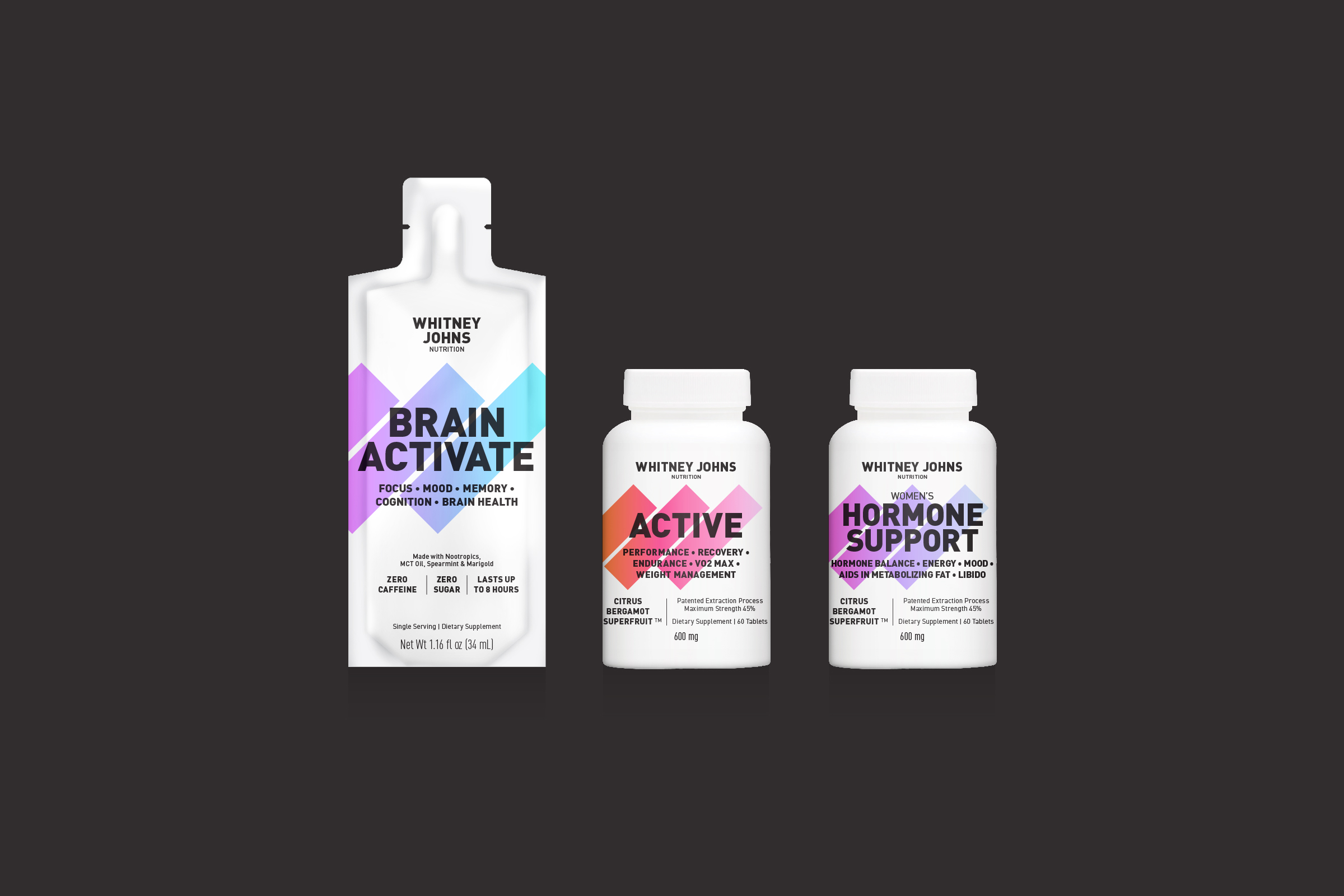
Whitney Johns is a fitness model, influencer, coach and personal trainer. She launched her own line of supplements to help others reach their fitness goals.
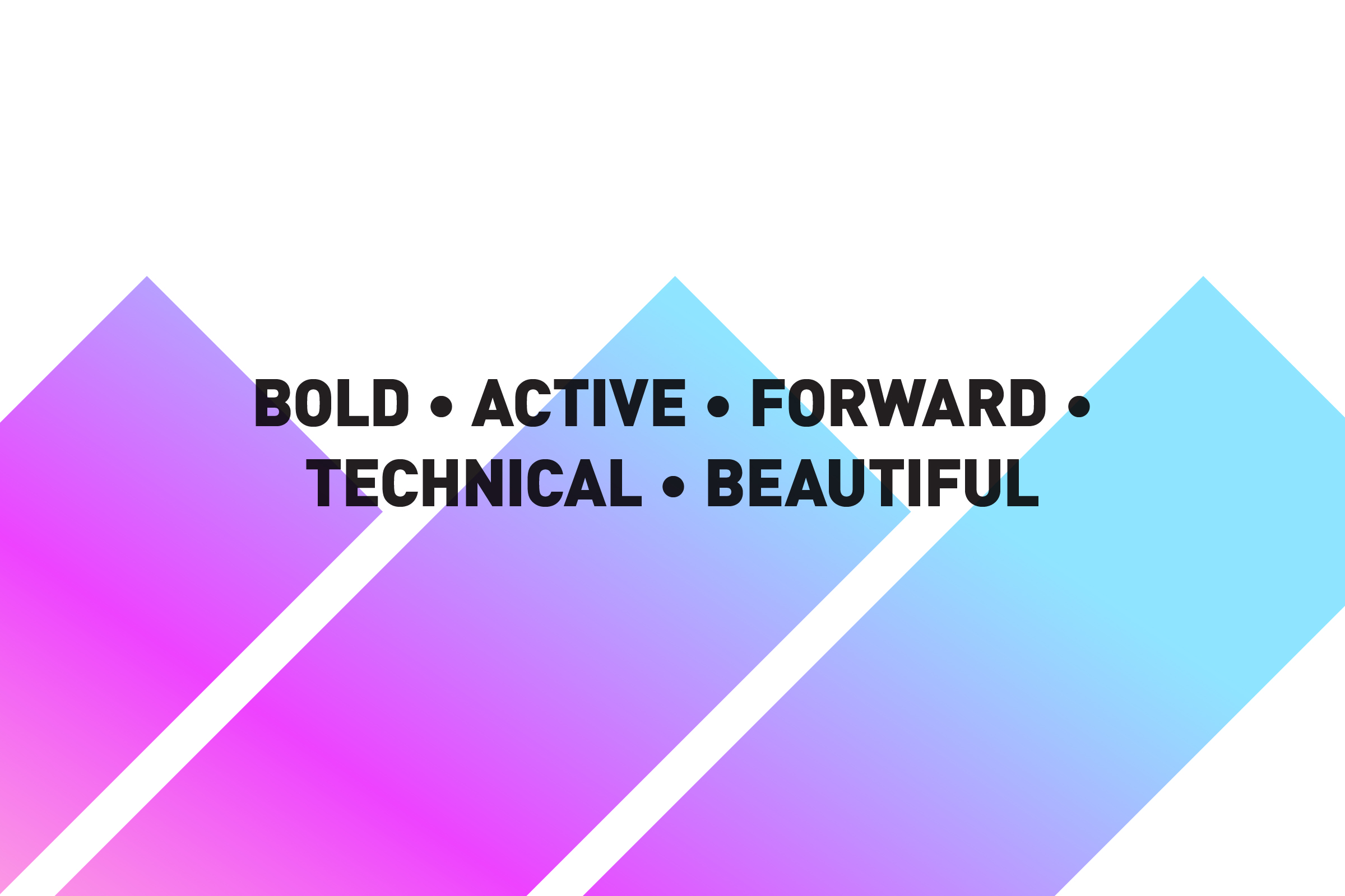
One of the main challenges was to give Whitney a design that was both informative and graphically impactful. Borrowing techniques from letterpress and screen printing, I came up with a simple solution—clean typography overprinting bold bars of color. The graphic bars, forming a monogram W, are forward, technical and beautiful.
Collaboration with Pliant
Selected Works
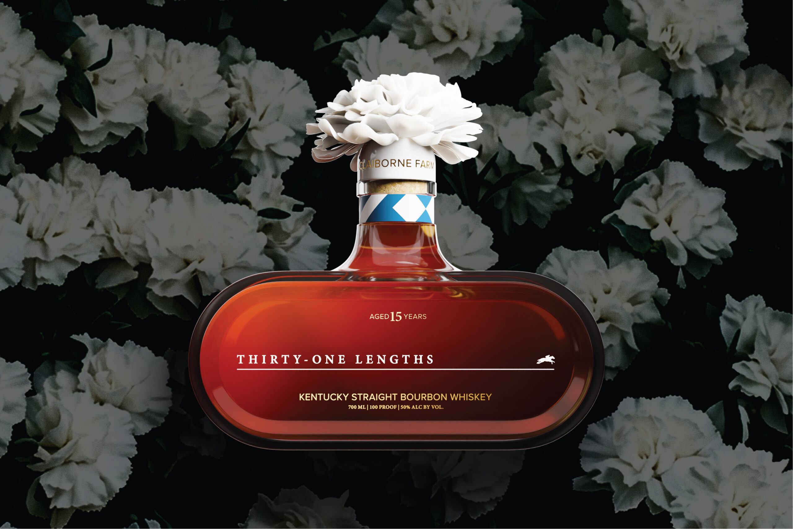
Thirty-One LengthsSpirits Packaging
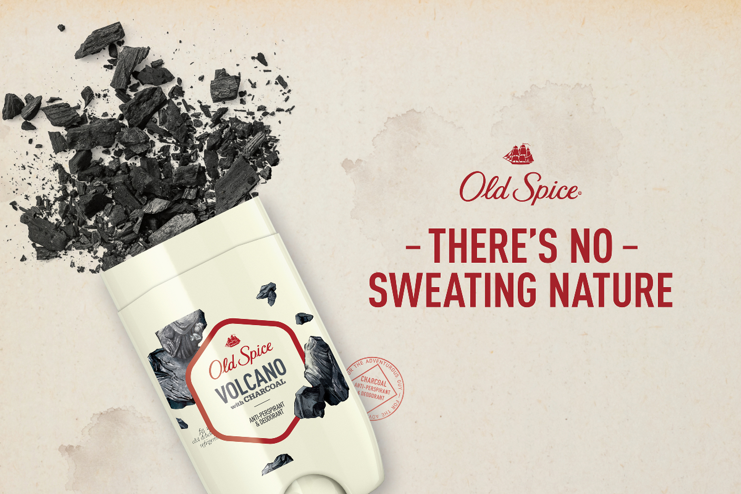
Old Spice—Fresher CollectionPackaging Design
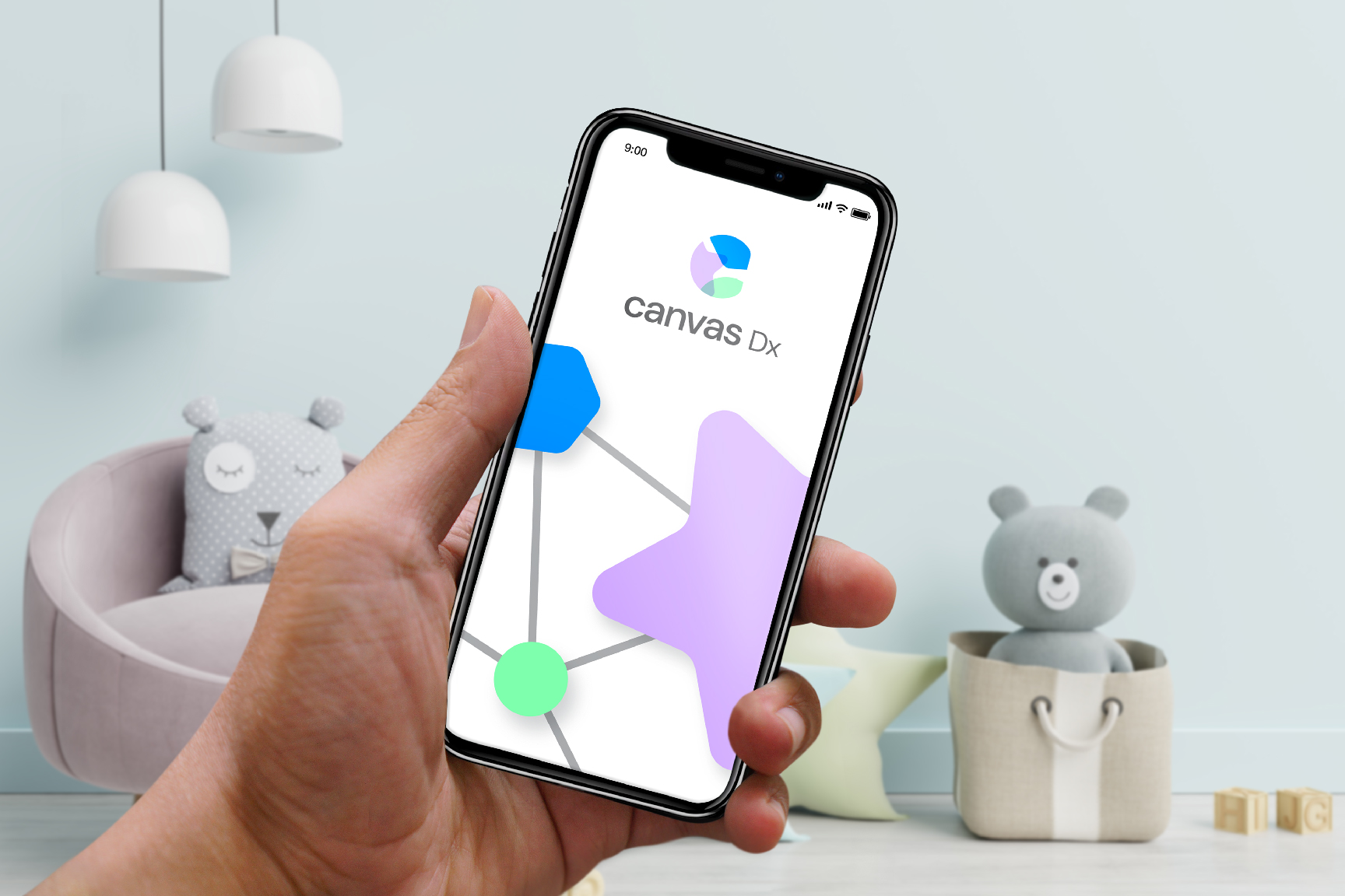
Canvas DxBranding
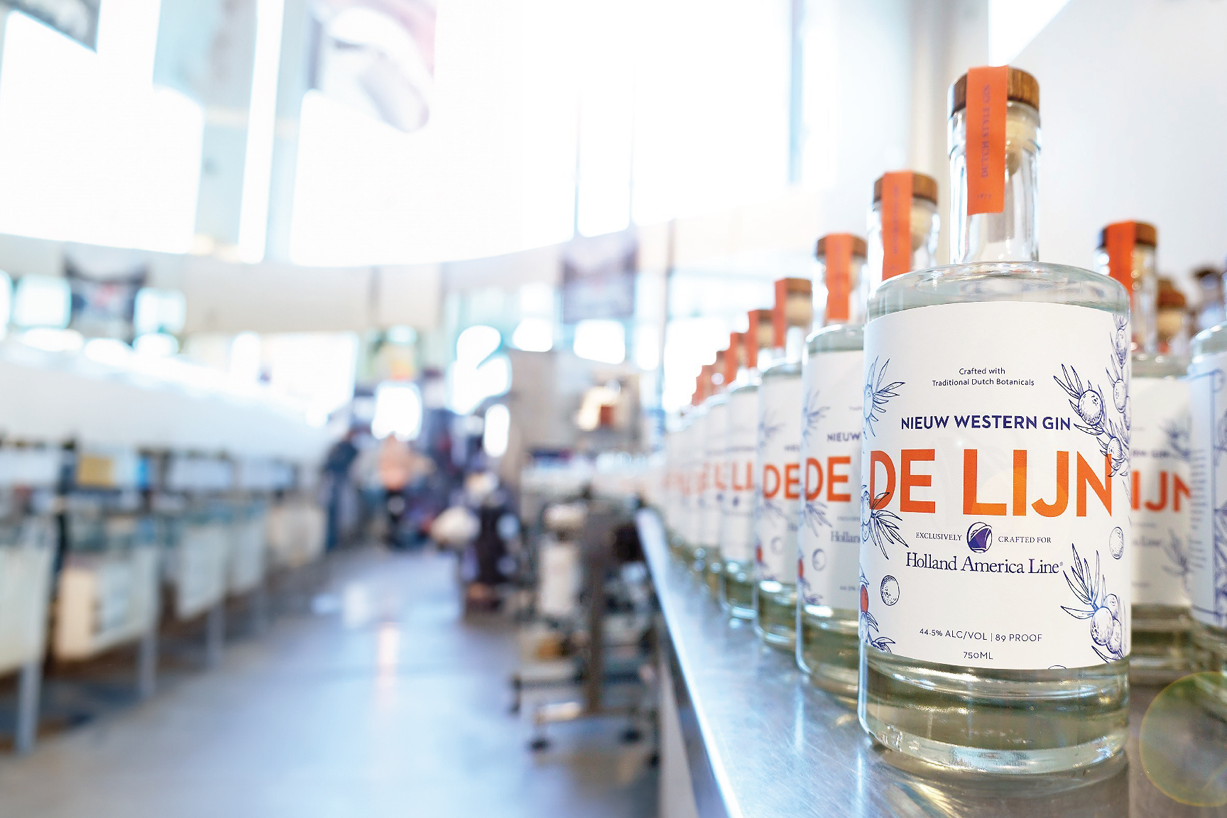
Holland America Line—De LijnPackaging
ABF—American Bar FoundationProject type

Old Spice—Misc.Misc.
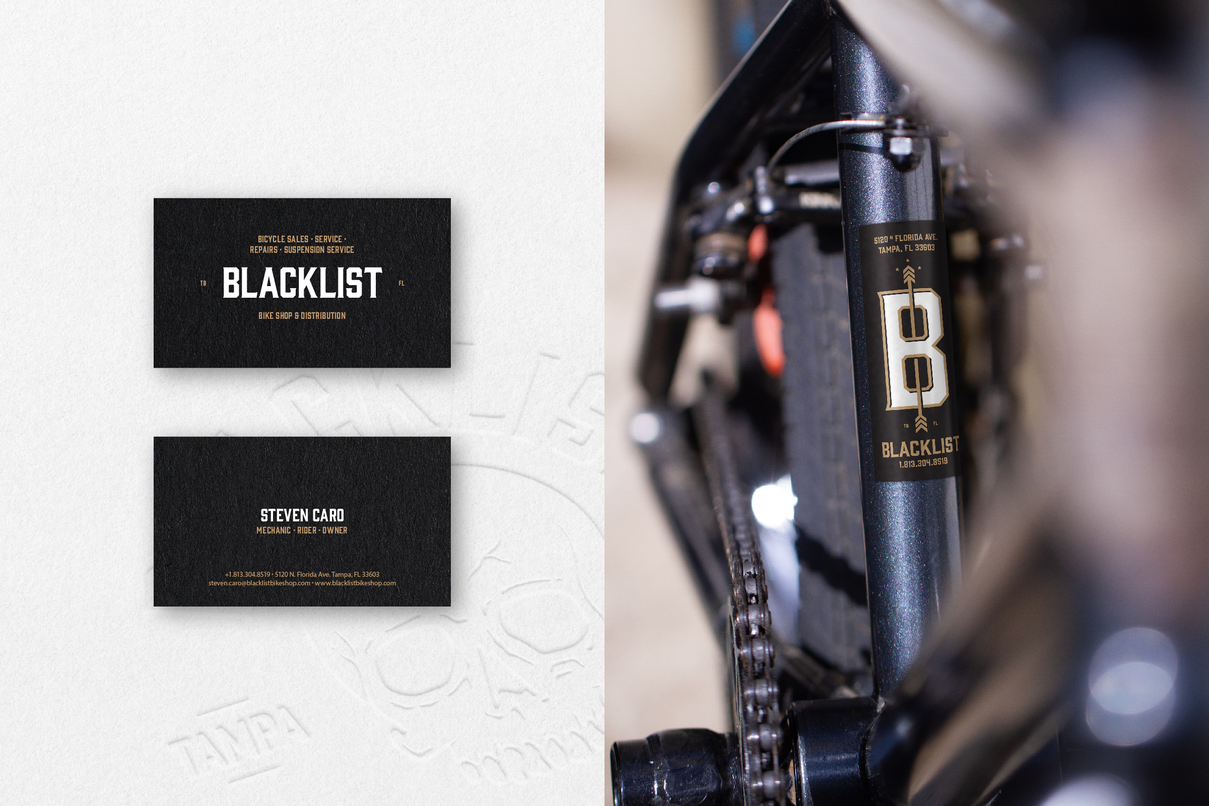
BlacklistBranding

Sequel Insurance ServicesBrand Identity
Whitney Johns NutritionPackage Design & Wordmark
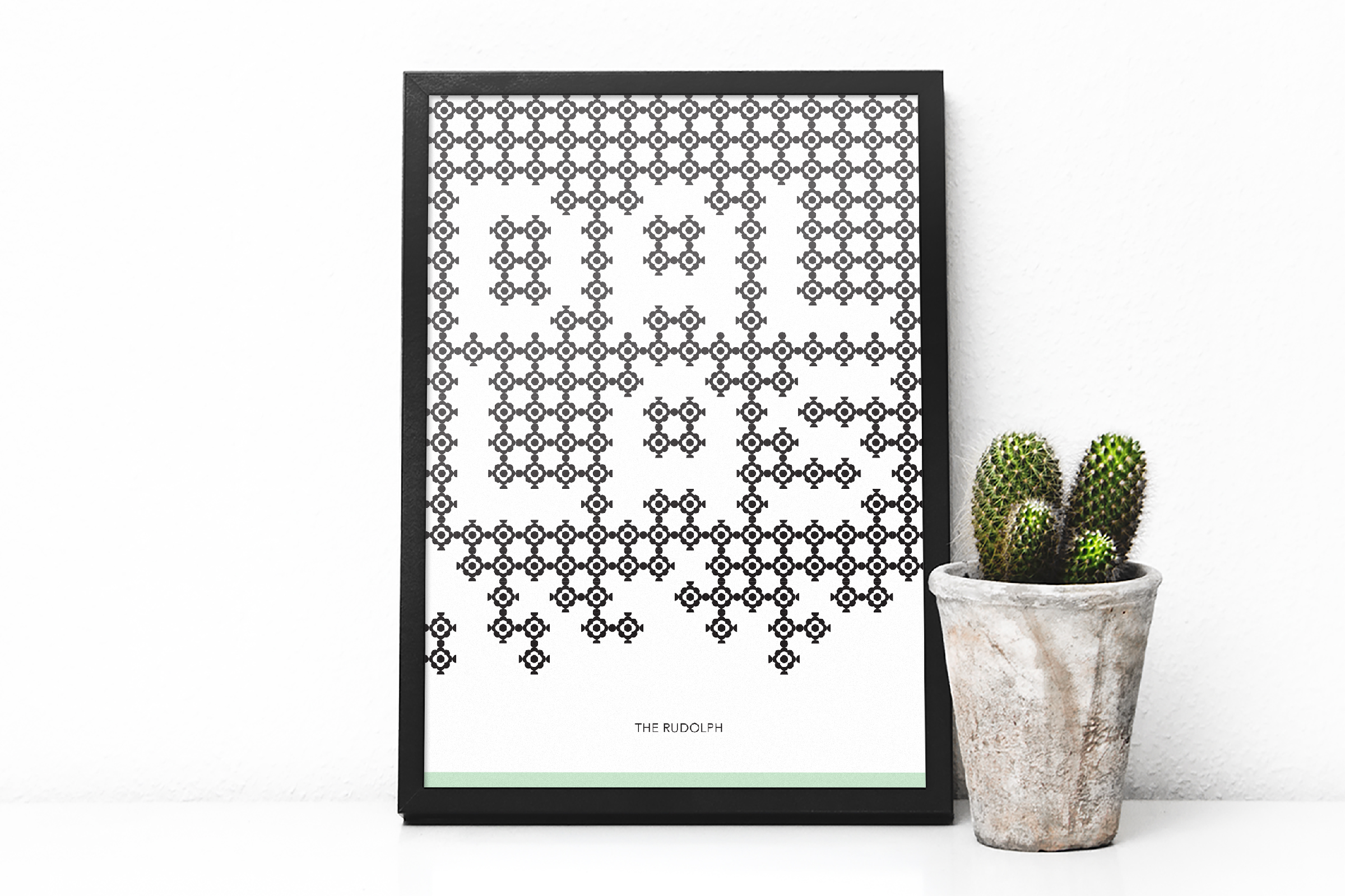
The RudolfBranding