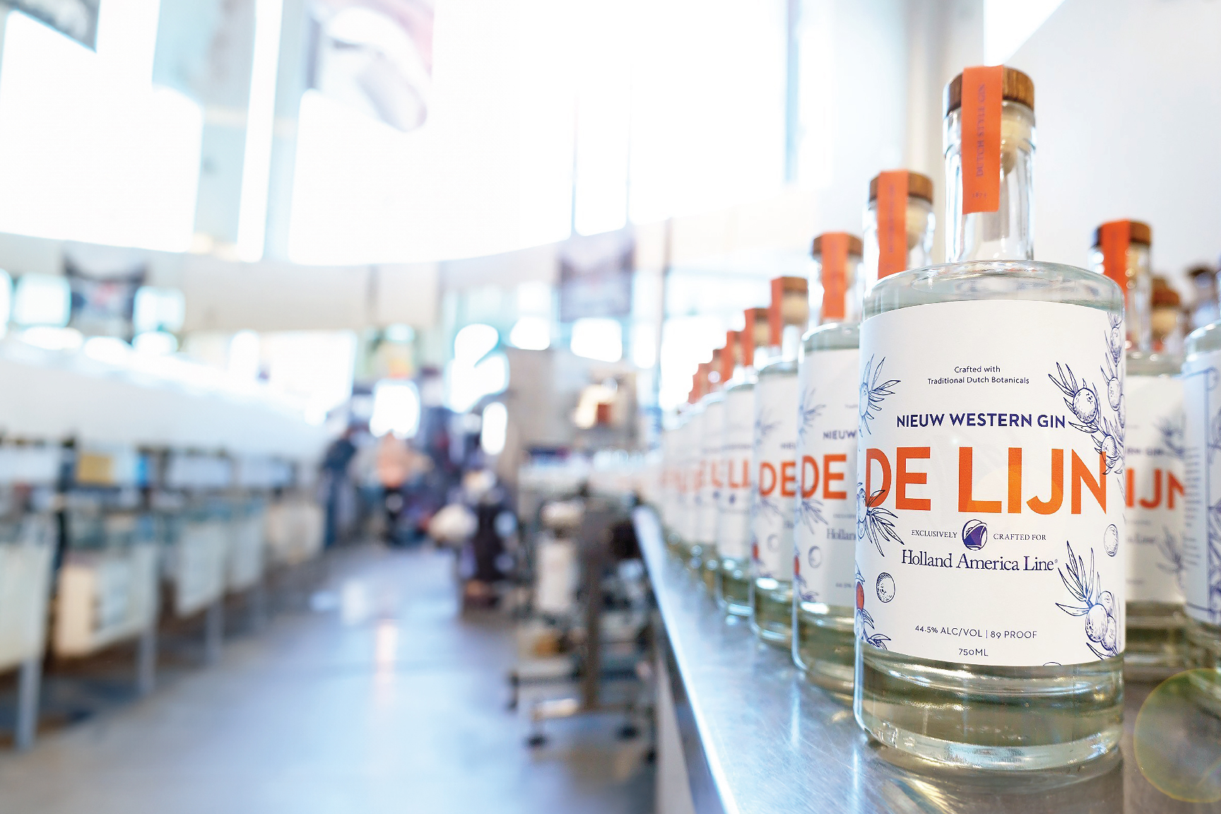
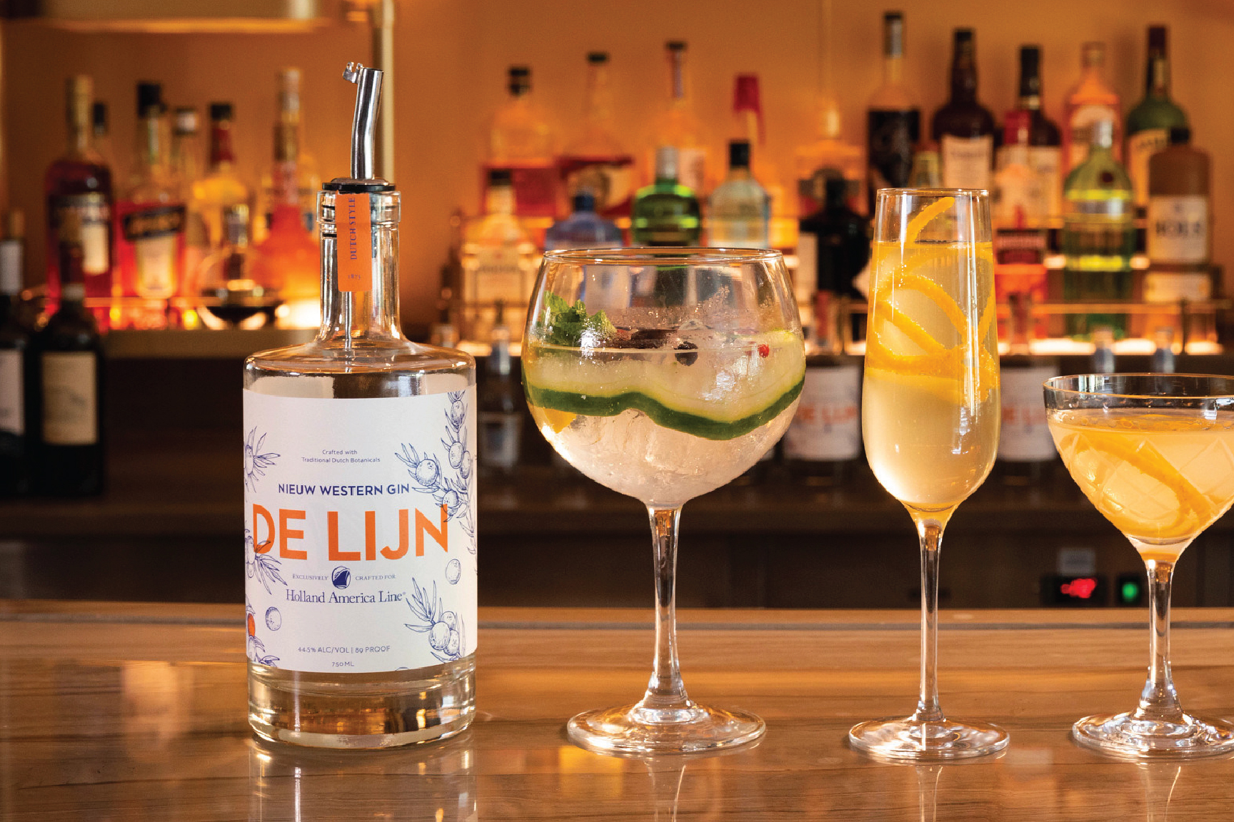
De Lijn—a signature gin launched to help celebrate the 150 year anniversary of Holland American Line. This bright and floral gin is exclusive to those passengers lucky enough to board HAL vessels.
The design embraces the spirit of the brand's Dutch origins. Our team pushed for a Dutch name, translated as "The Line." The blue and white illustrations brings to life the rich botanical flavors through a style we've dubbed Modern Delft, inspired by the classic Delfware pottery. Accents of Netherlands orange provide an added punch of color and saturation. One illustrated juniper berry colored orange as an added Dutch accent.
Collaboration with Faculty
Selected Works
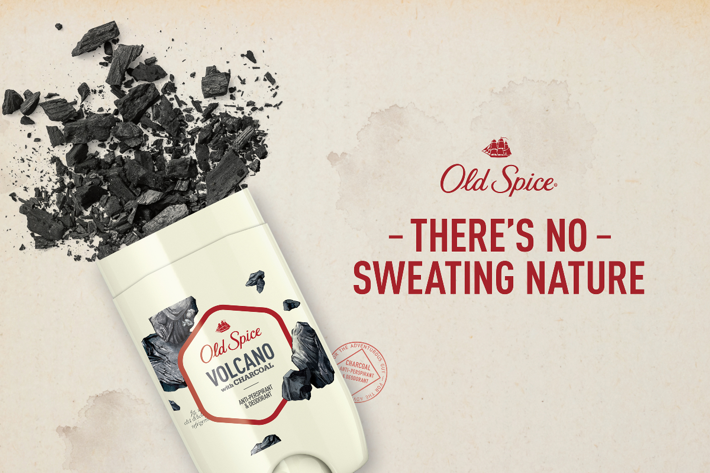
Old Spice—Fresher CollectionPackaging Design

Canvas DxBranding

Holland America Line—De LijnPackaging
ABF—American Bar FoundationProject type
Old Spice—Misc.Misc.
BlacklistBranding

Sequel Insurance ServicesBrand Identity

Whitney Johns NutritionPackage Design & Wordmark
The RudolfBranding