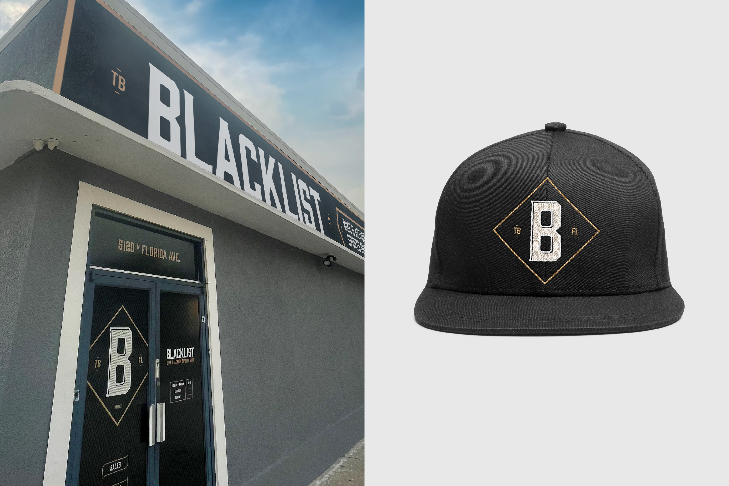
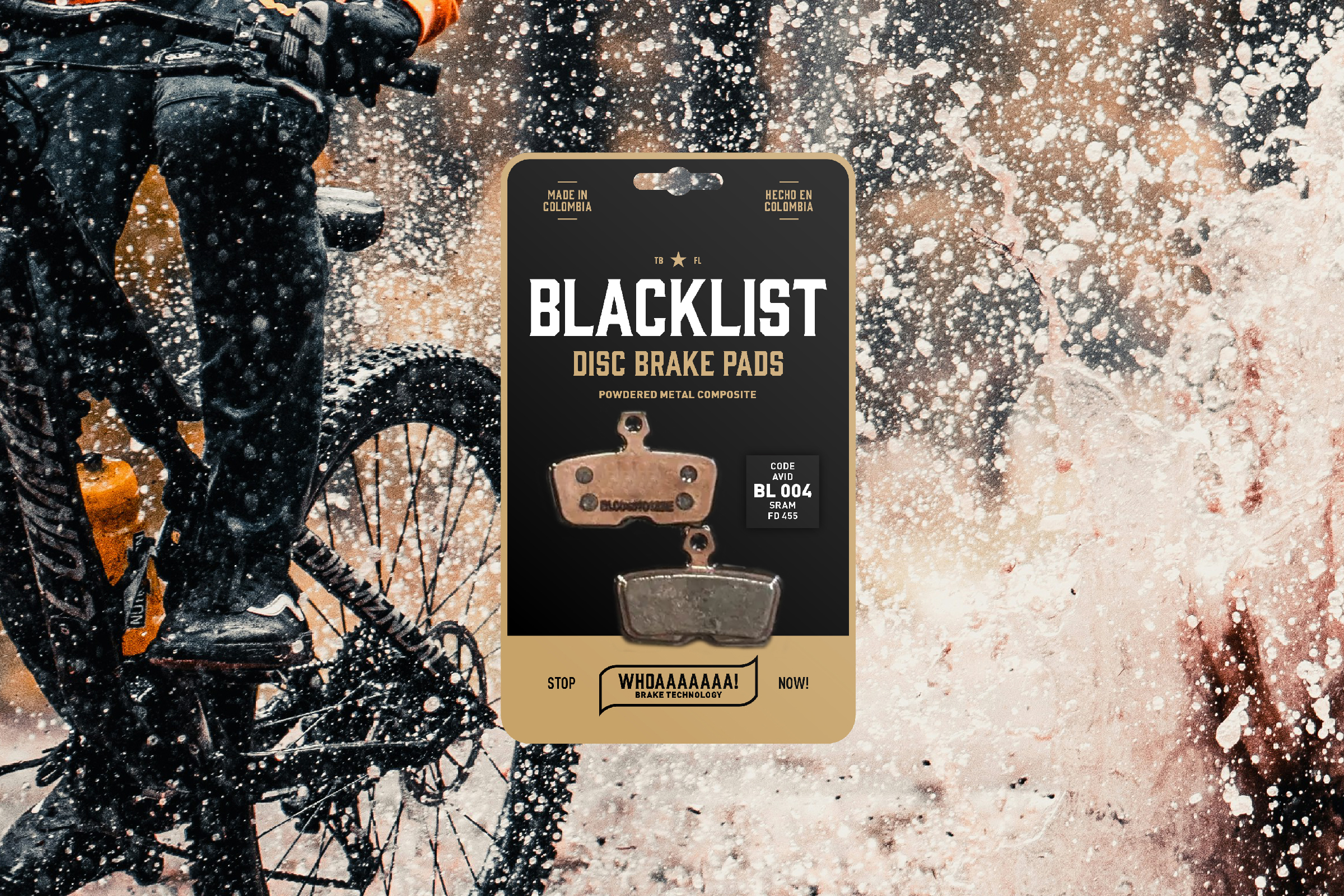
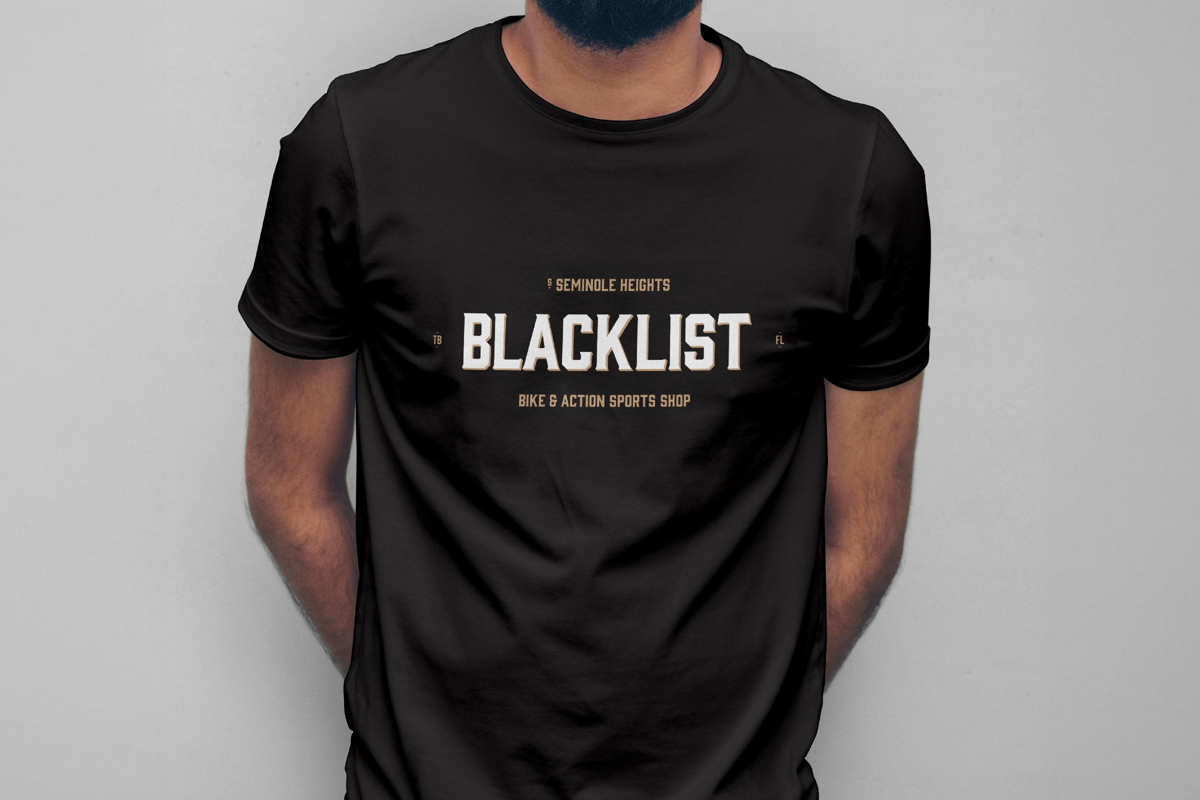
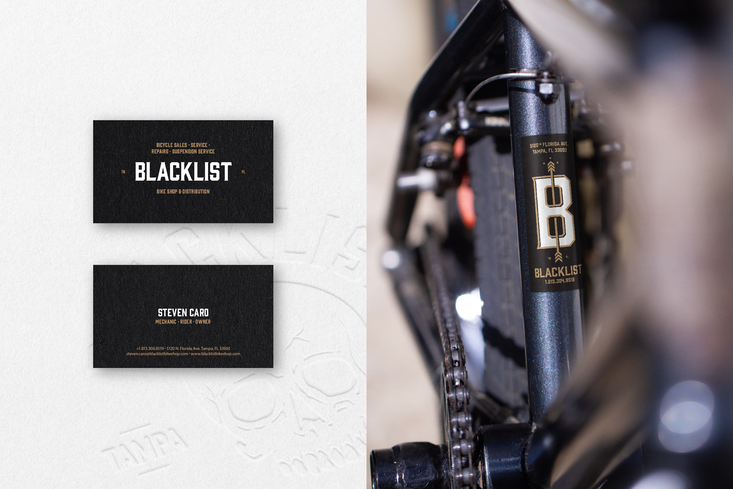
Blacklist started as a passion for bikes. Founded by a longtime bmx rider and mountain biker. Blacklist started as bike shop, but quickly expanded into components and distribution.
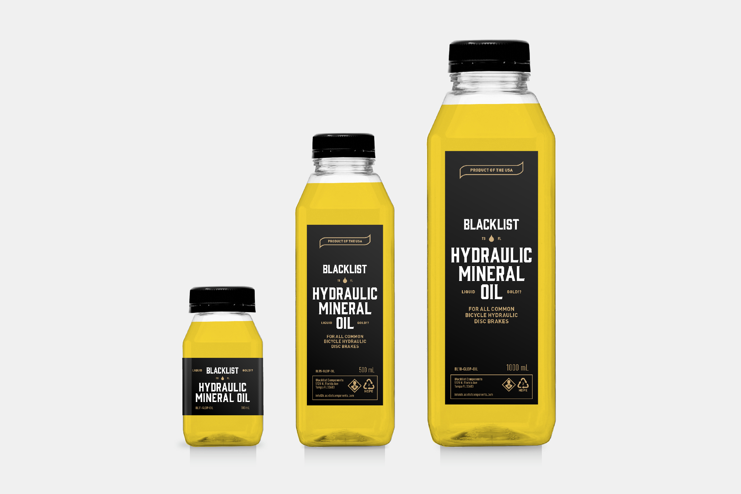
We thought the shop should feel like a cool place to come hang out, have a chat and check out bikes. I designed a nostalgia inspired series of wordmarks and monograms, utilizing consistent type choices and a tight color palette of black, gold and white. This gave us a brand with flexibility, and a strong visual unity that plays through packaging and visual system.
Selected Works
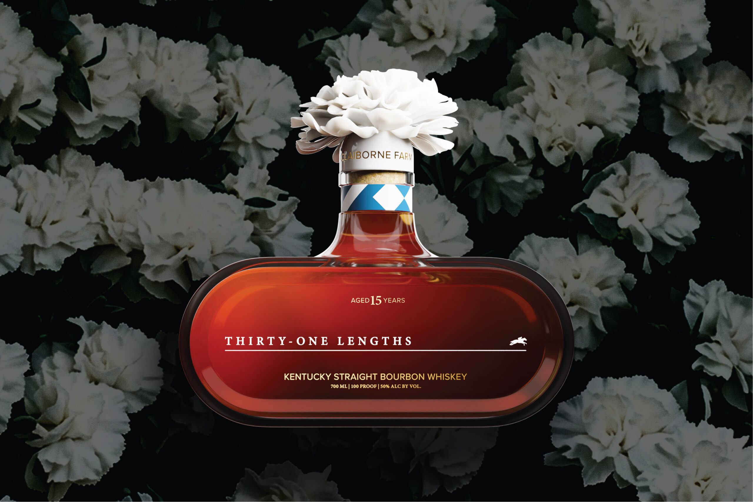
Thirty-One LengthsSpirits Packaging
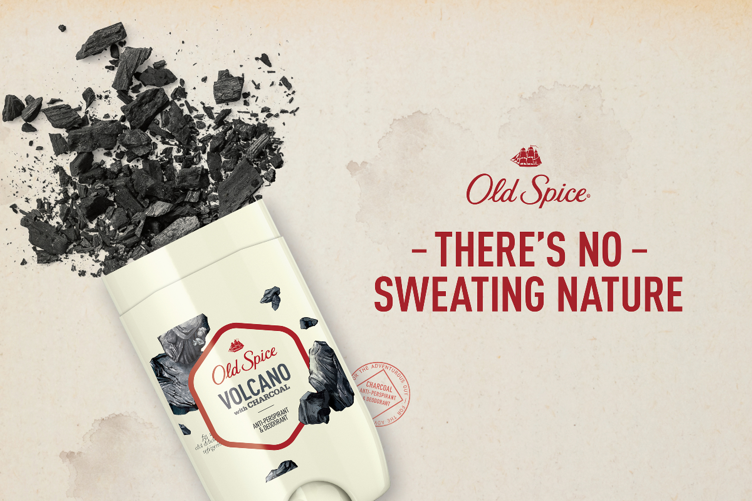
Old Spice—Fresher CollectionPackaging Design
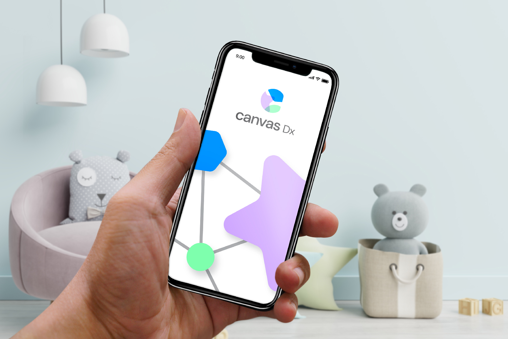
Canvas DxBranding
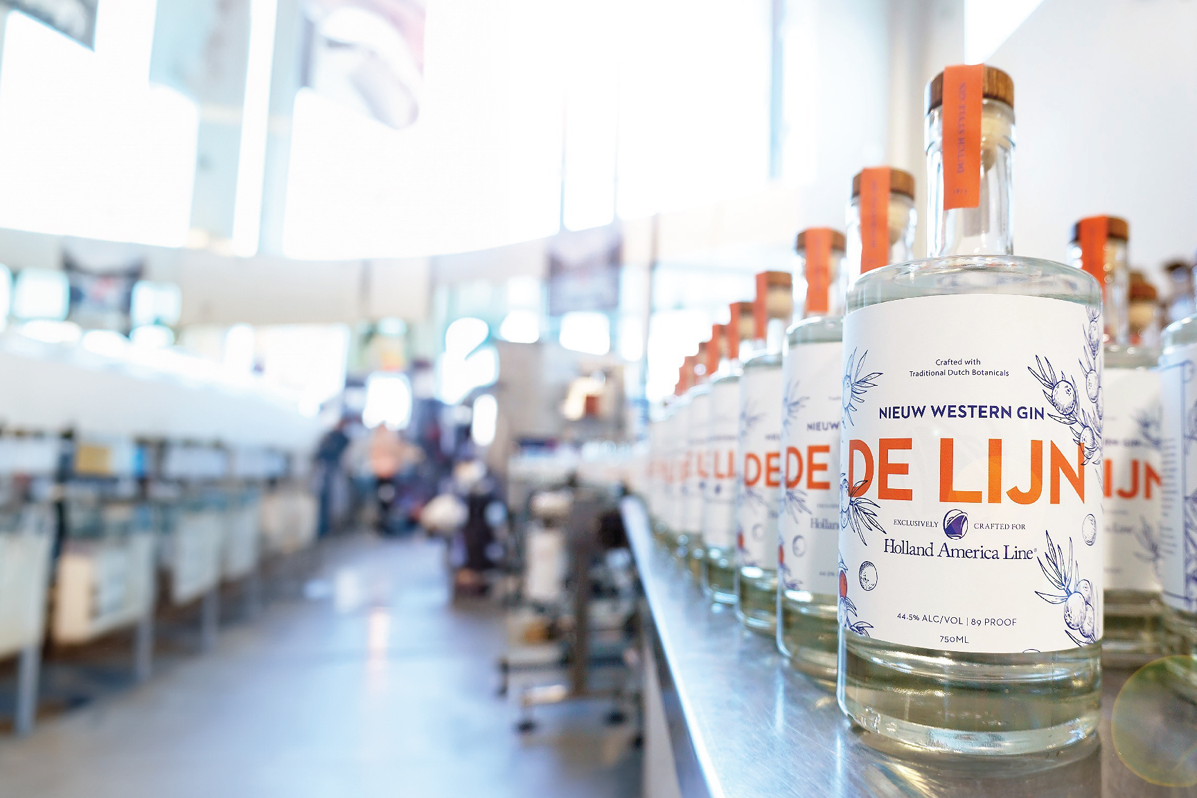
Holland America Line—De LijnPackaging
ABF—American Bar FoundationProject type
Old Spice—Misc.Misc.
BlacklistBranding

Sequel Insurance ServicesBrand Identity
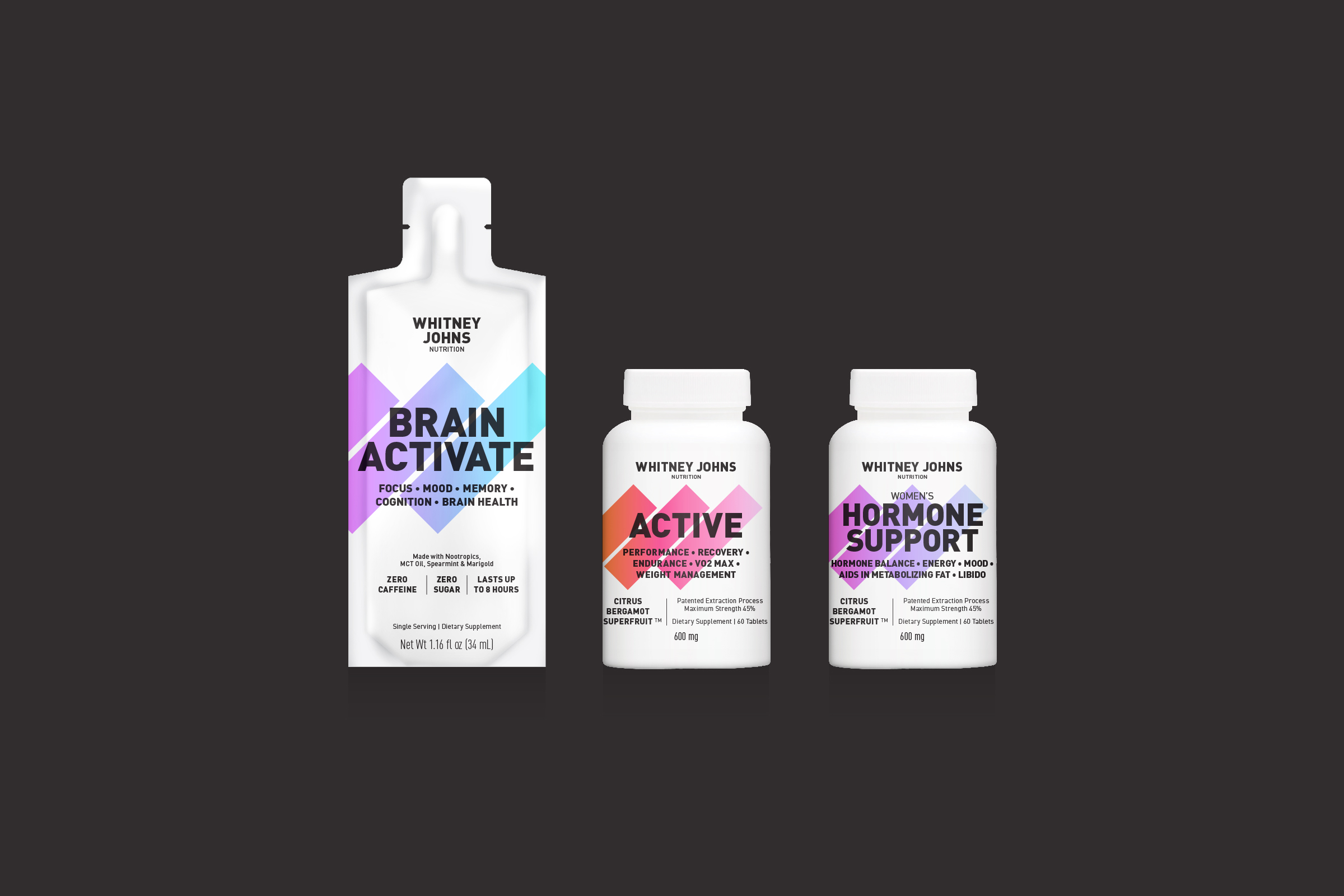
Whitney Johns NutritionPackage Design & Wordmark
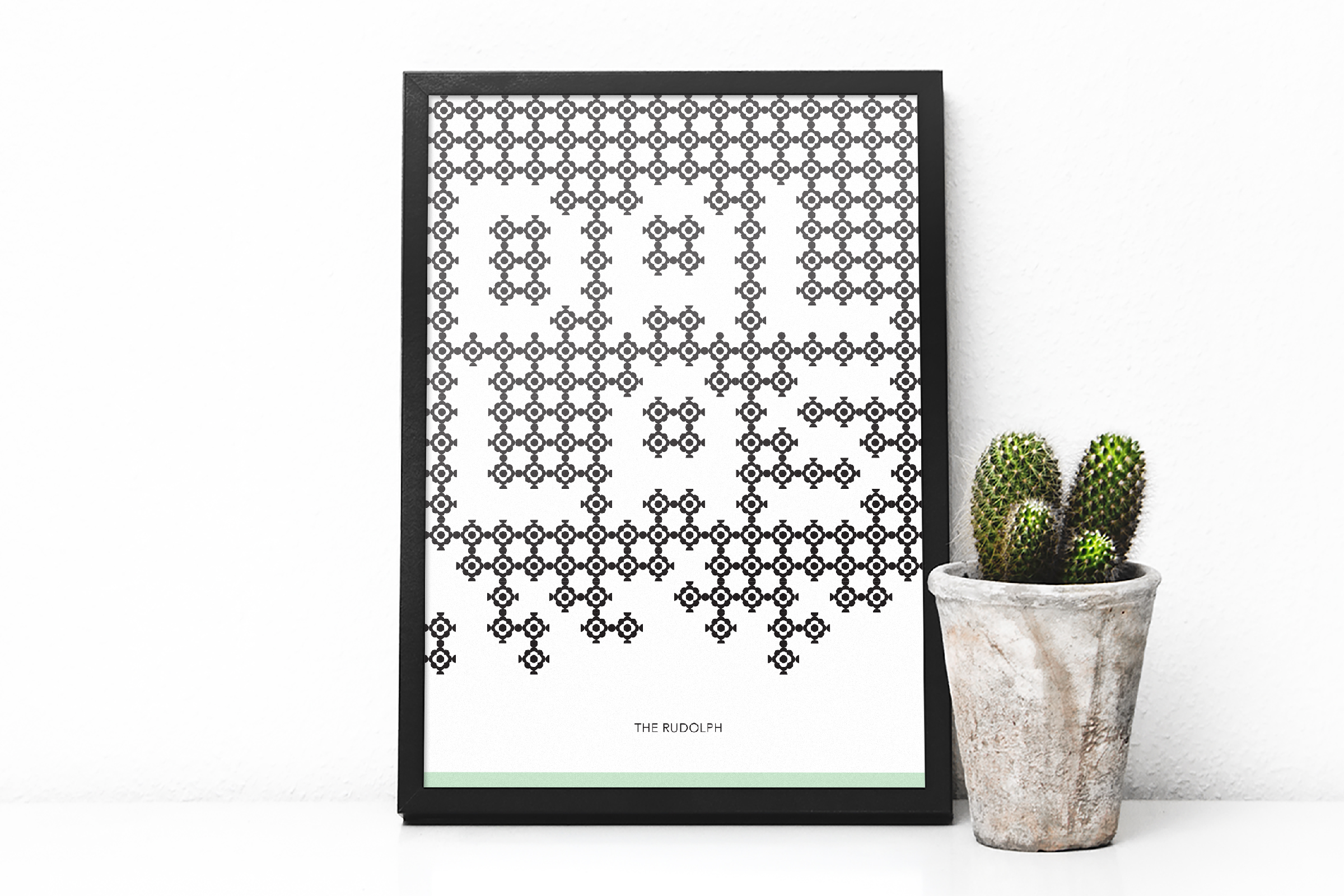
The RudolfBranding